Full-stack genomics data engineer, student and musician (CDBaby here) shares a thought: technology promises abundance but leaves us wanting. More than technology we need compassion.
Docker is an open platform that both operations and developers use to build, test and ship applications. The platform facilitates agility by providing an easy way for team members to package applications into standard containers. A container provides everything an app needs to run and nothing more.
How is a Docker container different from a VM?
The Docker engine is a software component that is installed on any physical, virtual, or cloud host with a compatible OS. This component leverages the host kernel such that it runs multiple root file systems (containers) each sharing the host kernel. Docker containers do not replicate the full OS (unlike VMs). Instead they share the underlying kernel, running isolated and unaware of one another. Docker Networking can be used to create a multi-host network that enables containers to talk to one another but this is not a requirement.
Docker containers do not package up the OS. Instead they package the application with all the OS-level services required for that application to run. Docker containers do not replace traditional VMs, they compliment them.
What are the benefits?
Developers love Docker because it lets them quickly build and ship new applications. Since containers are portable and can run in most any environment (with a Docker Engine installed) developers go from dev, to test, to staging and production without a blip, without recoding. Docker containers makes it easier for developers to debug, update images and ship them.
Ops teams love Docker because it lets them more easily manage and secure their environments (while allowing developers to adopt a more self-service style). The Docker CaaS platform deploys on-site and features security hooks such as role-based access control, LDAP integration, image signing, and more.
What is the infrastructure cost?
The Docker engine itself is lightweight (around 80 MB total) and is the only required component (installed on a bare metal server, a VM, or in the cloud). Install the engine and you’re done.
Can Docker help manage my infrastructure?
Docker isn’t designed to manage infrastructure (the platform itself is infrastructure agnostic). Instead, it manages applications and helps ensure that they’ll run smoothly, regardless of infrastructure. This provides the agility, portability and control necessary to forget about infrastructure. What you can’t forget about your team is still responsible for.
How many containers may be run per host?
The answer depends on your environment, the size of your application and the amount of available resources (i.e. CPU). Containers don’t magically create new CPUs though they do provide a more efficient way of utilizing them. Containers are lightweight and often last only as long as the process they run.
Getting started
An easy way to get started with Docker is with Docker for Mac (or Docker Windows). Each provides a native installation and from here you’ll start by creating a Dockerfile. This is the blueprint of a Docker Image, where all application configurations are specified.
One misconception about Docker is a by-product of its current focus on microservices. Docker is great for microservice-based apps, but it works just as well to containerize large applications. Docker containers package any application (monolithic or distributed) and can migrate workloads to any infrastructure.
Returning to orbit
Assuming that you’ve downloaded and installed Docker, here’s an easy way to get landsat-util running locally.
>>dockerpulldevelopmentseed/landsat-util
Test to see that our Docker image executes as expected. The following should print out landsat-util’s help menu.
A connectome is a wiring diagram of connections between neurons ranging in scale from a limited set of cells and synapses to larger structural and functional points of connectivity between regions of the brain. Broadly speaking, the term connectomics describes the effort to map and ultimately comprehend the vast organizational complexity of neural interactions in the brain. The terms connectome and connectomics were first coined by Olaf Sporns in 2005.
Pennies from Heaven
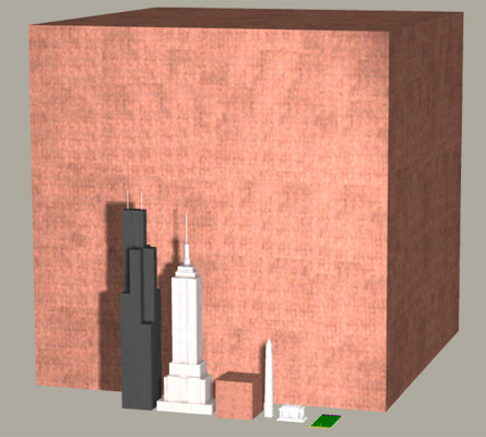
The human brain holds roughly \({10^{11}}\) or 100 billion neurons. Each has on average 7,000 synapses making the number of potential links between elements on the order of \({10^{15}}\) orone quadrillion. To give an idea of what a quadrillion looks like:
This is a cube of copper pennies 2,730 feet long on each side. The smaller cube (next to the Empire State Building) represents 1 trillion pennies. (See The MegaPenny Project).
Current estimates of brain connectivity often fail to take into account the brain’s mercurial makeup. The brain possesses an extraordinary ability to modify its own structure and function in response to change, both as the result of external events and in accordance with the organism’s innate developmental blueprint.
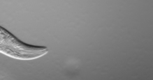
Mapping networks at the level of connections got its start way back in the 70s with the study of the roundwormC. elegans. More recently the field of connectomics has seen rapid rise in part due to computational advances that allow for the semi-automated collection and analysis of previously unheard of volumes of data. Here I describe some of the challenges that arise when managing and modeling connectome data.
Elegant Worms
Caenorhabditis elegans is a nematode roundworm, generally slender and circular in cross section. It is non-pathogenic and grows to about 1 mm in length. While C. elegans is about as primitive an organism as can be, it shares many essential characteristics relevant to the study of human biology, in particular to human neurobiology.
By far the most complex organ in C. elegans is its nervous system. Of a total of 959 cells, 301 in C. elegans are neuronal. 20 of these are located in the organism’s pharynx (which has its own nervous system). The remaining 281 make up its various head and tail ganglia along with additional ganglia running along its main longitudinal axis.
As a species, C. elegans is remarkably consistent in terms of anatomical structure, especially with regard to the number and placement of its neurons. That is to say, the neurons of any one instance of C. elegans is functionally identical to that of any other. Such consistency has allowed researchers to amass a large and increasingly accurate portrait of C. elegans systems biology over time. Furthermore, all of this information is available to whomever is interested (though you have to look for it).
Constancy of cell number and of cell position from individual to individual is an attribute known as eutely. Eutelic organisms have a fixed number of somatic cells when they reach maturity, the exact number of which is constant for any individual of the species.
Enough talk, let’s have a look at the data.
Data ‘R’ Us
Here I’ll use the R language to help develop some initial insight into the connectome dataset. Before we can use R we first need to get the data into R and luckily it supports all sorts of data formats.
Flat files can be imported into R with functions like read.table() and read.csv() from the pre-installed utils package. The packages used to import flat file data in R are readr and fread.
Excel files are imported into R with either the readxl package, gdata or with the XLConnect package.
The haven package lets you import SAS, STATA and SPSS data files into R.
The following R script loads a CSV file containing an abridged version of the complete C. elegans dataset.
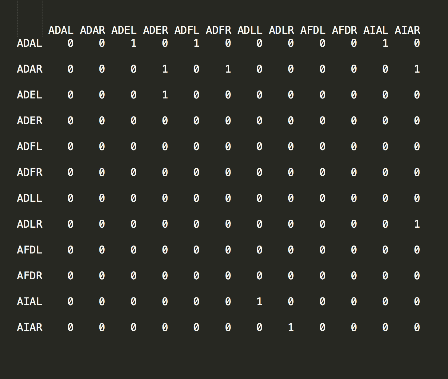
Over time C. elegans’ eutelic property has allowed every cell in the organism to be carefully plotted and catalogued by researchers. This effort has resulted in each cell being labeled with a proper name - ADAL, ADAR, ADEL, etc - and a position in the organism that is consistent from one instance to the next.
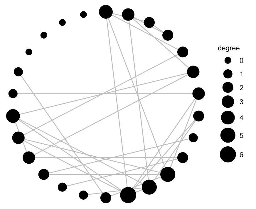
After coercing the data into matrix form (line 20) we create an adjacency graph object in line 23. From this we can see that these are indeed connected data.
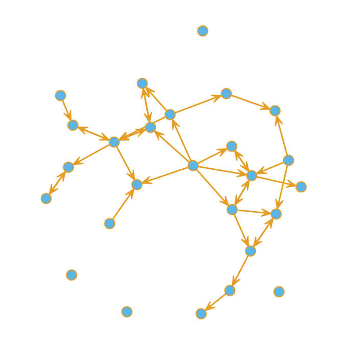
A quick plot reveals that some nodes are more highly connected than others. Bear in mind this is just a sample of the complete dataset.
Finally, we can use ggnet() to hone in a bit on the degree of connectivity. The ggnet and ggnet2 packages allow us to visualize networks as ggplot2 objects.
I’m sharing a series of posts that document my experience running a two-year agricultural research grant. This project was funded through the Sustainable Agriculture Research and Education SARE section of USDA and considers the application and use of low-cost vegetation indices such as NDVI (more on that later). It was motivated by two important issues in sugarcane farming: 1) seasonal nitrogen input represents a significant cost to farmers; 2) excess nitrogen in the environment alters ecosystems and potentially harms human health. Learning how to manage nitrogen application better is thus motivated by the economics of sugarcane agriculture as well as by the need to address an ongoing environmental issue. For all you agri-geeks out there some of what follows includes reference to the software and code we used to develop and derive our results.
Background
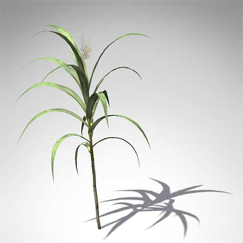
Our crop is sugarcane (Saccharum officinarum). First introduced into the Americas in 1751 it is the highest valued row-crop in the state of Louisiana. While recent years have witnessed a decline in overall sugarcane acreage, crop values have remained stable due to increases in yield. Since increased yield is attributable mainly to the addition of nitrogen fertilizer, how we manage N application is relevant to farmers (in terms of the economics) and to everyone else (in terms of the environment).
Goals
Our study goal was to determine whether low-cost aerial NDVI and other indices could accurately correlate variable N rates when applied to sugarcane. A secondary goal was to determine if such analysis was useful in predicting the yield potential of a future crop. Our work was carried out with the intention of revealing techniques that are affordable, accessible to ordinary farmers and, most importantly, effective.
We asked two questions:
Can variable nitrogen rates be correlated with multi-spectral imagery?
Are models of acquired multi-spectral imagery predictive of yield?
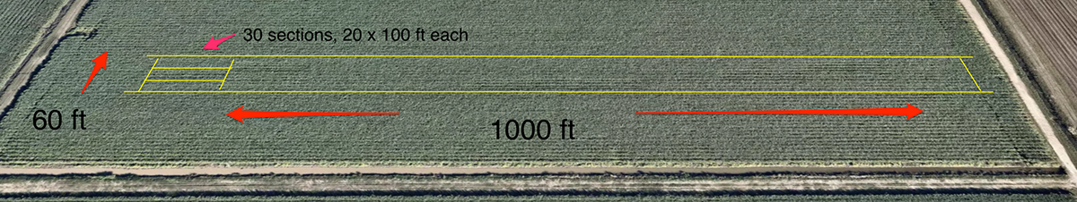
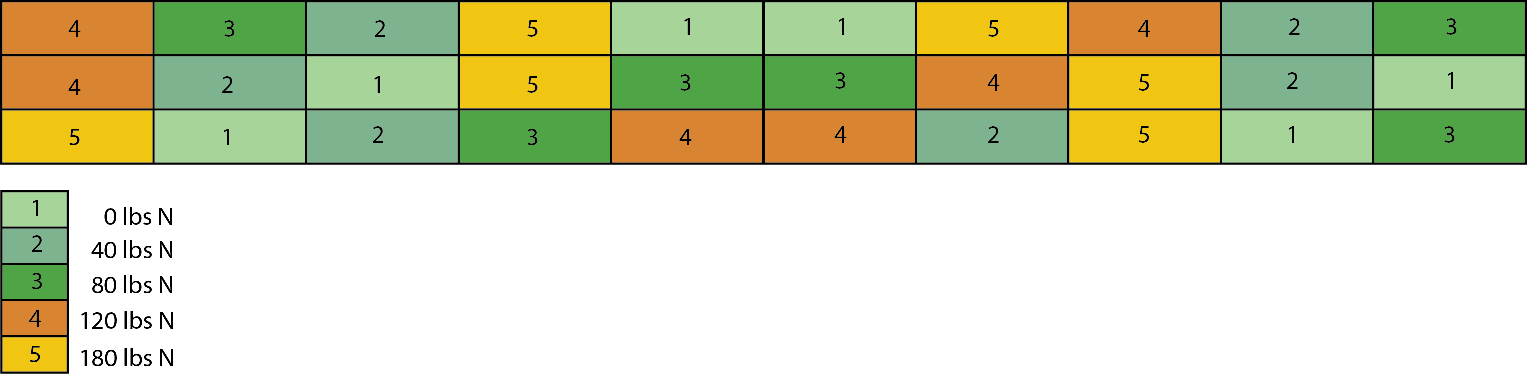
To answers these questions a study area was set aside, planted and harvested over two three successive seasons. We used a Latin Square design divided into 30 sections over an area of 1200 by 60 ft. Here is a overview of the area located in Houma, LA.
As indicated below five levels of nitrogen fertilization (0, 40, 80, 120 and 180 kg·N·ac−1) were applied in a trial setup with six replicates. This gave us 30 individual plots (100 × 20 sq ft each) making a total trial size of ~1.5 acres.
Tools
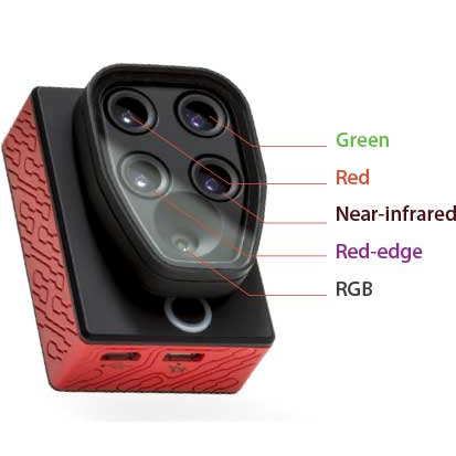
Creating a vegetation index first requires getting a camera into the air. As we progressed we used kites, balloons and ultimately an unassisted aerial vehicle (a drone). We created our own multi-spectral cameras along with rigs needed to reproducibly fly them. Ultimately we got help from the folks at Micasense and used their multi-spectral camera, the Sequoia:
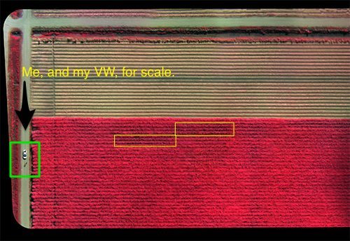
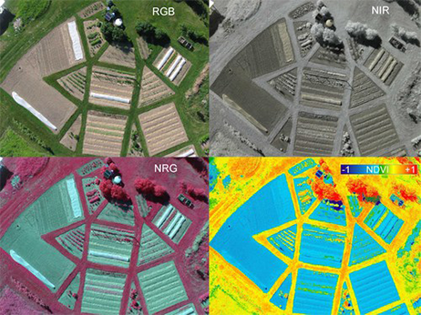
The Sequoia is about the size of a GoPro camera. It’s lightweight enough to fly from a consumer-style drone such as the 3DR Solo. Flying this camera over a field allowed us to collect light reflected in a variety of ways. The Sequoia is sensitive in the Green, Red, Near-infrared and RedEdge bands and by manipulating these bands we created different vegetation indices, one of which is known as the NRG. Most folks are familiar with RGB images but in an NRG image the standard RGB colors (Red-Green-Blue) are exchanged for a different set of color bands: NIR (Near-infrared), Red and Green. Here is an example NRG image:
The image above is a composite NRG of a sugarcane field taken on a clear day in late October, 2018. It’s made up of many smaller images in a process involving orthorectification and image-stitching. The two yellow rectangles are the test plots. The green square highlights my white Jetta (and me).
Data
Completing this grant involved many long days in a sugarcane field gathering data but it also required time in front of a computer screen trying to make sense of the data. The following is a code snippet that acts to separate each band of light from the original ‘raw’ data file that’s produced by the Sequoia camera. This is just one part of a much larger image-processing pipeline developed to help automate the work.
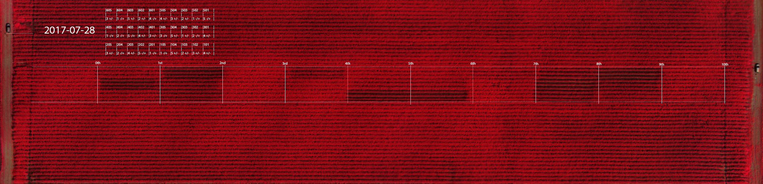
The process of separating individual bands of light, stitching together hundreds of smaller images, and running computational methods over the result ultimately produces an image like the one shown below. This image (acquired on July 28th, 2017) shows the full study grid as an NRG image at the height of the growing season.
If you look closely you can see a car that appears twice in the image - once in the upper-left and again at the far-right. The study area was too long (1200ft) to be covered in a single flight; it had to be flown twice during each capture - once for the left half and once for the right. We would set up and fly one side, pack everything up and drive to the other and fly again.
A more interesting observation are the shades of red color visible in different parts of the grid. Earlier I mentioned how we treated sections of the area (each about 100 ft by 20 ft) with varying amounts of nitrogen fertilizer. The shades of red signify different intensities of near-infrared light reflected from each section. The treatment of 0 kg·N·ac−1 (#1 in the colored grid at the start of this post) appears as a visible pattern and reveals that differing amounts of nitrogen fertilizer are discernable in terms of the amount of NIR light they reflect. In the next post I’ll explain why.
The Datum
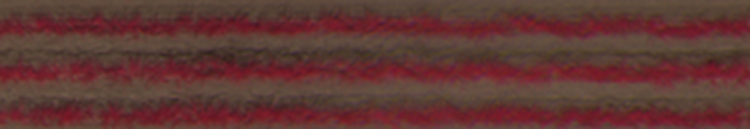
Before moving on I show an image of a single treated section. After going to the trouble of stitching hundreds of images together we had to cut the image up again into smaller samples for statistical analysis. The section above represents a single treatment (one ‘datum’) gathered on a specific day during the sugarcane growing season from late April to mid-November. More than a dozen useable samples per treatment from this field were captured (30 times 12, ~360). Each is spaced in time as evenly as weather permitted, starting a week prior to fertilization and ending four days before the harvest.
In Part I we introduced the basics without filling in the blanks. In this post and others we’ll get into the weeds.
Our project was extended over a second and then a third season after too much rain and too little knowledge of how to capture stable images. In the first year we experimented with kites, balloons and home-made cameras, producing thousands of pictures. While these efforts could indicate, roughly, what the health and status of a sugarcane field was on any given day they could not show how one section of crop compared to another, or how one day compared to the next.
Our interest was to discover what vegetation indexes were best at 1) correlating with and 2) predicting sugarcane yield. We assumed the first question would surrender to the least sophisticated method (we were partly right). The second question was harder. It turned out to be far more challenging unless the data captured was of high quality.
A Picture’s Worth
An effective spectral index is built in stages by capturing light of the right band, at the right time of day, in the right part of the season. During our study it became apparent that the ability to place a camera in reproducible position for sufficient time was the key to capturing data that could provide more than a rough assessment of crop health. Likewise, it became clear that the ability to capture in the narrowest band possible with minimum distortion was crucial.
A vegetation index can be created using a consumer digital camera as all consumer sensors are sensitive in the near infrared band of light. If the camera is modified such that one channel captures the visible light and either of the other two channels capture the NIR (by removing the IR blocking filter and inserting a dual band pass filter) then an otherwise ordinary point-n-click can serve as a multi-spectral sensor.
Here I’ll lay the groundwork for a series of posts that will detail how Luigi can be used to orchestrate a more complex set of tasks. In this case a Luigi pipeline helps coordinate the periodic search and retrieval of LANSAT 8 image data. It then prepares that data for upload ontoS3, runs scikit-image and scikit-learn analytics on it, and finally dumps the output so that an API endpoint can serve up the result (through a custom Flask web app). I don’t expect readers to understand how all these separate technologies work. How Luigi glues them together is the point. Primarily, I hope to demonstrate that a tool like Luigi can help shield the data engineer from knowing each and every detail regarding how a pipeline actually functions. Before we open up the hood some background is in order.
Awesome Bands
About a year ago Amazon Web Services began providing up-to-date access to Landsat 8 data via their (highly reliable) AWS infrastructure. The AWS open data initiative includes an extensive archive of Landsat 8 imagery - including individual spectral bands not previously available - allowing anyone access to this valuable information via predictable download endpoints.
Landsat 8 imagery is an incredibly powerful resource. People from around the world have come to rely on it for everything from evaluating drought and predicting agricultural yields to tracking conflict.
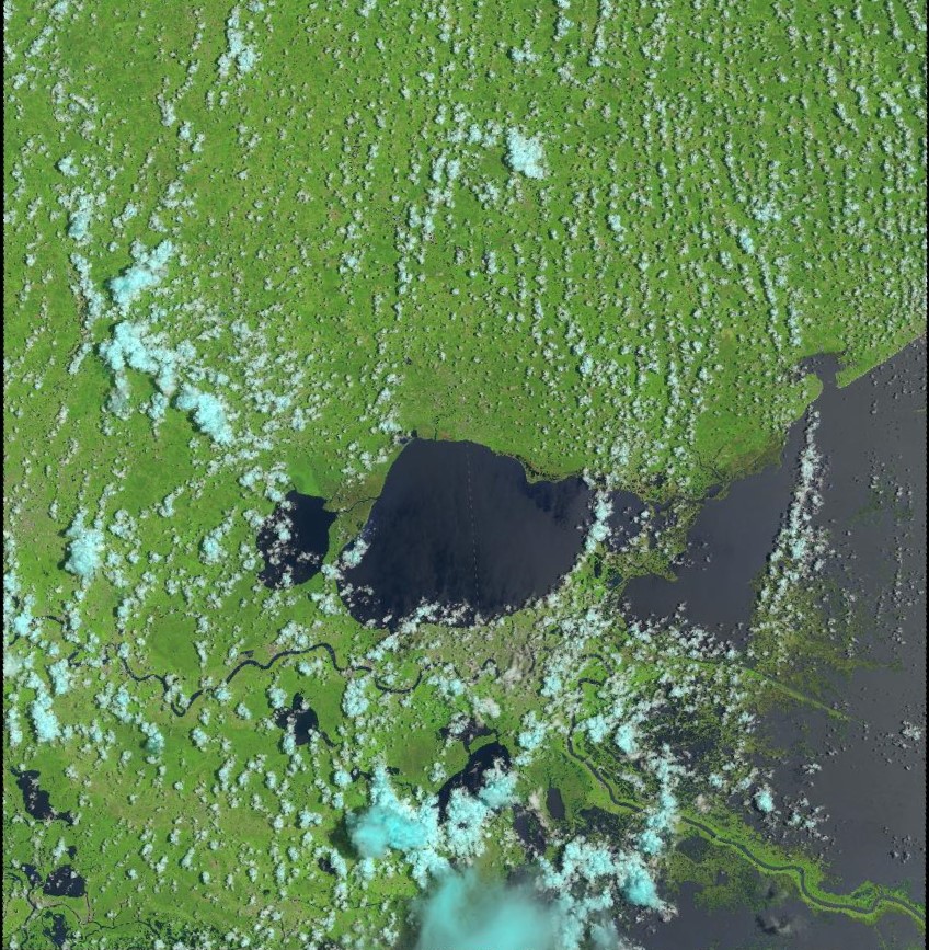
Landsat 8 provides moderate-resolution imagery of Earth’s surface, from 15 metres (panchromatic) to 30 metres (multispectral) to 100 metres (thermal) per pixel. (The above is a capture of southeast Louisiana roughly centered on Lake Ponchartrain). The term per pixel refers to the ground sample distance or GSD which is a way of relating distance between pixel centers to actual distances measured on the ground. For example, in an image with a one-meter GSD, adjacent pixel locations are 1 metre apart on the ground. In the above, each pixel represents a 15 x 15 m “box”, or 2421 square feet (or the size of an average condo in Manhattan).
Landsat 8 operates in the visible, near-infrared, short wave infrared, and thermal infrared spectrums (9 bands total). For the purposes of this project we are interested only in the red, green and near-infrared bands. The following chart specifies several bands with regard to the satellite’s Operational Land Imager (OLI).
Spectral Band
Wavelength
Resolution
Solar Irradiance
Band 8 - Panchromatic
0.500 – 0.680 µm
15 m
1739 W/(m²µm)
Band 2 - Blue
0.450 – 0.515 µm
30 m
1925 W/(m²µm)
Band 3 - Green
0.525 – 0.600 µm
30 m
1826 W/(m²µm)
Band 4 - Red
0.630 – 0.680 µm
30 m
1574 W/(m²µm)
Band 5 - Near Infrared
0.845 – 0.885 µm
30 m
955 W/(m²µm)
Panchromatic is the combination of all human-visible wavelengths. While containing wavelengths normally associated with familiar RGB photography, an image from the pan band is more similar to black-and-white film in the way it combines light from the visible spectrum into a single measure of overall reflectance. The SI unit of irradiance is the watt per square metre (W/m2).
Getting Started
Landsat data can be a challenge to work with, especially for individuals or small organizations lacking tools. It can take a novice a day (or a week) to collect, composite, color correct, and sharpen Landsat 8 imagery. To help I’m using an open source toolkit called landsat-util. While this is not the only way to gain access to Landsat (more on that later) this particular tool makes it very easy to search, download, and process directly from the command line.
Searching with landsat-util makes us of the landsat-api which enables making geospatial, date and text queries on Landsat-8 metadata. (The metadata is released in csv format by USGS on a daily basis.)
Here is an example of searching with landsat-util:
The output of above is a JSON response which can be stored as out.json on the local file system. Next we parse the file and pull out those elements that are of interest.
The result is a list of (date, sceneID) tuples filtered such that only dates where less than 20% cloud cover occurred are captured. This filtering step is important for later in the processing chain.
We’ve searched Landsat for imagery taken between July 3 and July 10, roughly centered on New Orleans, and filtered the result for cloud cover. The next step is to download the filtered images and process them. Landsat 8 imagery acquired before 2015 is downloaded from Google Earth Engine while anything afterwards comes from AWS Public Data Sets. Here I am asking for a specific sceneID (returned as the result of the previous search) and requesting bands 3, 4 and 5.
>>landsatdownloadLC80220402016185LGN00--bands345
I’ve said nothing about the supporting software required to run landsat-util. The tool requires some amount of infrastructure and there may be performance and dependency issues when running locally. For now I’ll issue a promissary note with the suggestion that to more easily get landsat-util up and running, Docker is your friend.